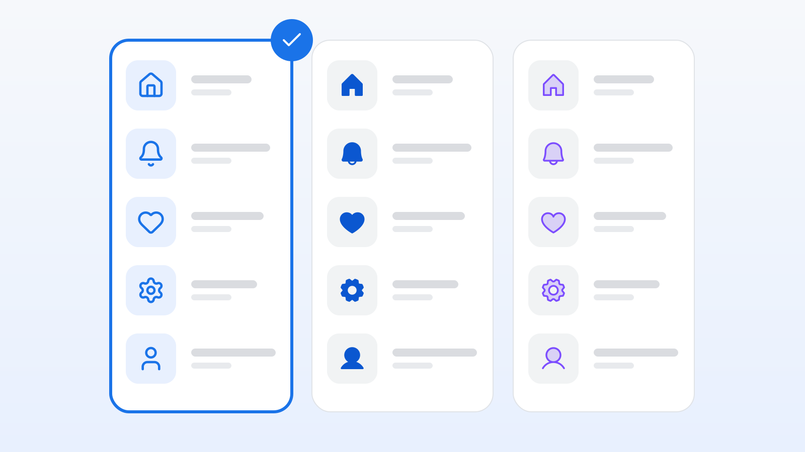
Mixing icon sets is the fastest way to make a polished UI look cheap. Pick one primary set early and stick with it. Here's how to choose.
1. Style: stroke, fill, or both?
- Stroke (outline) sets — Lucide, Tabler, Heroicons Outline, Iconoir, Hugeicons — read as light and modern and pair well with thin sans-serif type. Watch the stroke width: Lucide and Tabler use 2px on a 24px grid, Iconoir 1.5px.
- Filled sets — Material Symbols, Heroicons Solid, Bootstrap Icons — hold up better at small sizes (16px toolbars, mobile tab bars).
- Multi-weight sets — Phosphor (six weights), Solar, MingCute, Material Symbols (weight axis) — let you use outline for navigation and fill for the active state from one consistent family. If you need both, start here.
2. Grid size and optical alignment
Most modern sets are drawn on a 24px grid; Octicons and Radix on 16 and 15px; Fluent ships 12–48px variants. Use a set drawn at the size you'll display it — scaling a 24px stroke icon down to 16px produces muddy lines. Check that circles, squares and triangles are optically balanced (Lucide and Phosphor are excellent here).
3. Coverage
Count what you actually need: arrows, status, files, media, commerce, social, and any domain-specific glyphs (medical, finance, IoT). Tabler (6,200), Material Symbols (16,000 with variants), Fluent (20,000) and MDI (7,600) have the broadest coverage; Heroicons (1,300) and Radix (340) are deliberately small. A quick way to test: search your ten hardest icon names on IconsDB with the set filter on.
4. License
Anything MIT / Apache / ISC / CC0 is safe for commercial use with no credit. CC-BY sets (Font Awesome Free, Solar) need a credit line. Avoid GPL for product UI. See our licenses guide.
5. Maintenance and tooling
Prefer sets that ship official packages for your stack (lucide-react, @tabler/icons-react, @phosphor-icons/react, @heroicons/react) or that work through Iconify / unplugin-icons, which covers every set on IconsDB. Check the release cadence — a set that hasn't shipped in two years won't have that new "sparkles" icon you'll want next quarter.
Sensible defaults
| If you want… | Try |
|---|---|
| A clean stroke set for a web app | Lucide, Tabler |
| Outline + solid pairs with a design system | Heroicons, Phosphor |
| Maximum coverage, Google look | Material Symbols |
| Windows / enterprise look | Fluent UI System Icons |
| A distinctive personality | Iconoir, Solar, Pixelarticons |
| Brand logos | Simple Icons (mono), SVG Logos (colour) |
Whatever you pick, add the second set only for things the first can't do — logos and flags are the usual exceptions — and keep the visual weight matched.